- open git terminal/cli
- git branch new-branch-name (make new branch)
- git checkout new-branch-name (switch to new branch)
- git push -u origin new-branch-name (make push/pull possible through Rstudio)
- make changes and save files
- add changes with Rstudio or git add
- commit changes with Rstudio or git commit -m “Commit message.”
- push changes with Rstudio or git push origin new-branch-name
Tag: r
Comparing two lists with R
No, not list() lists.
a <- data.frame(name=old$NAME)
a$status <- "old"
b <- data.frame(name=allfields[allfields$StateAbbre=="ND",]$name)
b$status <- "new"

both<-merge(a,b,by="name",all=T)
Make two data frames, one for each list, create a column identifying each one (new or old), then join on the common column (name).
Output:
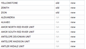
See also: http://stackoverflow.com/questions/17598134/compare-two-lists-in-r/17599048#17599048
Wordless Wednesday: Sparkle Time

Add Factors to a Momocs Coo Object
This wasn’t documented anywhere (maybe it’s obvious?), but here is a short example using the included ‘bot’ dataset.
data(bot);
# Look at the existing factors, stored in bot@fac
a<-bot@fac;
# Add another arbitrary factor
a[2]<-a;
a[2]<-c(1:40);
names(a)[2]<-“number”;
# Put your new factors back into the object
a->bot@fac;
# Look at your data based on the new factor
panel(bot,cols=col.india(40)[bot@fac[,”number”]]);
Formation tops to Petra, reshaped with R
To import formation tops to Petra, your input file needs to be set up as one row per well, one column per formation top, and each value being the depth measurement. In the example below, I am trying to rough out the depths of formations in Wyoming using only the TD (total depth) and BOTFORM (formation at total depth). Not the most precise method of building structural maps, but it will work on a large scale.
Input file has one row per well, columns api_full, TD, and BOTFORM (at least).
Caution: I tried to run this on the full WY well dataset (111,000 rows) and R used all 36 GB of my RAM and then crashed. It’s advisable to subset first.
#Read data in
wells<-read.csv(“Wyoming_allwells_headers.csv”);
#Simple sample
ws<-head(wells);
#Remember column names
names (ws);
#Required libraries
library(reshape);
#Example: reshape the sample, because the whole dataset is over 100,000 rows.
#Melt according to API and formation at TD
wsr<-melt(ws,c(“api_full”,”BOTFORM”),”TD”);
#Cast into a new data frame
wsc<-cast(wsr, api_full ~ BOTFORM);
Output will be one row per well, one column for each formation name in BOTFORM, and TD as the value.
I can add more information if there are questions. Reshape steps are from http://stackoverflow.com/a/1533577/2152245.
Using R to Create a Winner-Takes-All Raster from Point Data
I am to the point in my dissertation where I need to summarize a fair amount of data. The full data structure will be in the final manuscript, but for now suffice it to say that I am storing data as latitude/longitude pairs in a flat-file database (and using Panorama Sheets to query and modify it as needed). Point data can be exported from this database as a CSV (actually tab-separated) file and converted to a shapefile in QGIS.
For this project, the globe is divided into 1×1 degree cells. Each cell in my study area contains at least one vector point in my locality shapefile (exported from te database, above). Many cells contain multiple points, each of which may represent a locality interpreted as representing a different paleoenvironment than the others. I am using R to summarize these data points into a raster for each time slice I wish to study.
The method below emplys a winner-takes-all method, which is to say that during conversion from point data to raster, the points within each cell are evaluated for the values in the field ‘env_id’ (environment ID number, since we can’t use text in a raster), and the most frequent value of ‘env_id’ “wins” the cell and becomes the value burned into the output raster.
### Converting a point shapefile (with environment in numeric
### field env_id) into a raster
### Winner-takes-all.

# Load libraries for raster, maptools and mode
library(raster);
library(maptools);
library(modeest);

# Read in the locality point shapefile
locs<-readShapePoints("shapefile.shp");

# Make the base raster.
basegrid<-raster(ncols=360, nrows=180);

# Create a subset for the age you are looking at
locs_subset<-subset(locs,locs$time_slice==10);

# Convert the locality shapefile to raster.  Use the most frequent
# value of numeric field 'env_id'.
r<-rasterize(locs_subset, basegrid, field='env_id', fun=function(x, ...){mfv(x)[1]});

# View the plot (centered on SA)
plot(r,xlim=c(-100,-30),ylim=c(-70,52));

# View the plot (all)
# plot(r);

# Write the raster to file
writeRaster(r,"10 Ma.gtiff","GTiff");
Output from R looks something like the top image, and can be manipulated as any other raster in QGIS etc. Scale bar shows the numeric values used to represent different paleoenvironments in the raster; it’s not actually a continuous scale but I didn’t have a need to change the default R output.
Additional notes:
Work in progress: genus duration of freshwater mussels in the Hyriidae
My dissertation is dependent on the assumption that people make mistakes in identification and naming of fossil and modern organisms. In particular, I am proposing that certain freshwater mussel genera in the family Hyriidae have supposed taxon ranges that are far longer than they should be, however in order to be taken at least somewhat seriously I need to show that this could be the case and select candidates for further investigation.
The first figure is a simple taxon range diagram for several genera that are agreeably within the Hyriidae. The mean indicators can be ignored. It is apparent that three genera in particular stand out as being long-lived. This could be for a number of reasons: the genera may actually have survived for such long periods of time, certain specimens may have been misidentified, or certain nomenclatural lumping may have occurred inappropriately.
The second figure includes more information. The width of each bean is proportional to the number of occurrences of each taxon through time. Note that the full range of each taxon is not displayed on the second figure because it was produced from age estimates from (in most cases) surrounding stage boundaries.

I will leave it to the reader to determine whether I am on the right track.
Plots were produced in R using the function below, which is being released under the CRAPL. Data is from my personal locality occurrence database, which will become available on the completion of my dissertation.
ranges<-function(locfile,genera=c("Alathyria","Velesunio"),type="box",columns=c("D_no_dissertation_id","genus_bogan","species_source","ref1","age_start_ma","age_end_ma")) {
 # Make sure beanplot is available.
 library("beanplot");
 # Read in the data from a CSV file.
 localities<-read.csv(locfile);
 # List the genera you want.
 # genera<-c("Alathyria","Velesunio");
 # Create a place to store the selections.
 selection<-list();
 start<-list();
 end<-list();
 select<-data.frame();

## For bean plots
 # Grab the whole selection
 select<-subset(localities,localities$genus_bogan %in% genera & localities$age_start_ma!="NA" & localities$age_end_ma!="NA",select=columns);
 # Add mean dates to a data frame.
 select$mean<-ave(select$age_start_ma, select$age_end_ma);
 # Get rid of the unneeded genus names in the subset.
 select$genus_bogan<-factor(select$genus_bogan);

if(type=="box") {
 ## For box plots
 # Loop through the genera
 for (i in 1:length(genera)) {
 # Grab the columns you want.
 selection[[i]]<-subset(localities,localities$genus_bogan==genera[i] & localities$age_start_ma!="NA" & localities$age_end_ma!="NA",select=columns);
 # Sort by column age_start_ma (not needed at the moment).
 # selection[[i]]<-sort(selection[[i]],by=~"age_start_ma")
 # Find the start and end dates.
 start[[i]]<-max(selection[[i]]["age_start_ma"]);
 end[[i]]<-min(selection[[i]]["age_end_ma"]);
 }
 # Make the start and end lists into a matrix...the long way around.
 df<-data.frame(start=unlist(start),end=unlist(end));
 # Transpose the matrix.
 toplot<-t(as.matrix(df));
 # Make a box plot. Don't need to worry about whiskers because there are only two values. The y-axis is reversed.
 boxplot(toplot,names=genera,ylim=rev(range(toplot)),ylab=c("Ma"));
 # Show the data being plotted.
 print(toplot);

 } else if(type=="bean") {

 # Make a bean plot. This is more complicated. The y-axis is reversed.
 beanplot(select$mean~select$genus_bogan, ylim=rev(range(select$mean)), cut=0, log="", names=levels(select$genus_bogan), what=c(0,1,0,0),bw=20,col = c("#CAB2D6", "#33A02C", "#B2DF8A"), border = "#CAB2D6",ylab=c("Ma"));
 }

}
GIS: Raster cell centroids as vector points with GDAL and R
Short intro: I’m using raster data for part of my dissertation, but I’m storing the paleoenvironment data in a database as the latitude and longitude of the center of each grid cell. This lets me query my environment localities, add new ones, and make specific datasets.
Sometimes I take existing maps of other people’s environmental interpretations and digitize them, leaving me with vector polygon data. I need to convert the polygons into the same kind of data I’ve been storing. This is surprisingly hard in both QGIS and GDAL alone, so I finally figured out how to do it in R today courtesy of Simbamangu over at StackExchange.
See the attached images for how things look at each stage.
Below are the general terminal commands, first in GDAL and then R. I will try to add more rationalization and explanation later. My operating system is Mac OS X but these should be modifiable.
GDAL in your terminal
gdal_rasterize -at -where 'freshwater = 1' -a freshwater -ts 360 180 -te -180 -90 180 90 -l "source_layer_name_in_shapefile" "shapefile.shp" "output_raster.tif"
Produces a geoTiff of your input polygons where the attribute ‘freshwater’ is equal to ‘1’. For more detail I invite you to read the GDAL documentation, it’s quite good.
R
To run through a single file:
# load necessary libraries

library(maptools);

library(raster);

library(rgdal);
# Load the raster from a file
r <- raster("rastername.tif")
# Convert to spatial points
p <- as(r, "SpatialPointsDataFrame")
# Set name of column of raster values for later use
names(p)[1]<-"value"
# Get only the values we want (values above zero) in that column
psubset<-subset(p,p$value>0);
# Save as a shapefile (extension appended automatically)
writeSpatialShape(psubset, "outputfile");
You can also loop through a directory:
# load necessary libraries

library(maptools);

library(raster);

library(rgdal);
# Set working directory
setwd("/my/working/directory/");
# list all .tif files in working directory
for (file in dir(pattern="*.tif")) {
r <- raster(file);
p <- as(r, "SpatialPointsDataFrame");
# Set name of column of raster values
names(p)[1]<-"value";
# Get only the values we want (values above zero)
psubset<-subset(p,p$value>0);
# Make a new filename
oldname<-substr(file, start = 1, stop = nchar(file) -4);
newname<-paste(oldname,"pts",sep=" ");
# Make a shapefile
writeSpatialShape(psubset, newname) ;
# Make a CSV file
# Convert to data frame so you can drop extra columns
psubsetdf<-as.data.frame(psubset)
write.table(psubsetdf[,c(2,3)],file=paste(newname,".csv",sep=""),sep=",", row.names=FALSE);
}