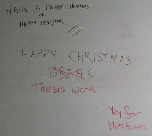
It’s the time of year again where I get a break from classes and from being in North Dakota in general, and get to go visit the folks for a few weeks and get some down time. “Down time” being, for a graduate student, the opportunity to get some serious work done without the distractions of classes, advisors, people down the hall, etc.
One of the projects I want to get mostly completed by the time I return in January is to produce two graphics based on literature and museum data concerning my family-level taxon of study. The first of these will be a range chart of the fossil and modern genera (if not species…we’ll see), the second a map showing where all of these taxa can be found. To the commonfolk (i.e., anyone who has never tried this before) this might seem easy, but it’s really going to take a lot of digging through old papers, searching PDFs, and racking up a heck of a list for interlibrary loan next semester. I rediscovered earlier this week that although there may be a lot of information out there on my taxon, some authors didn’t do the best job of organizing what they knew.
Now, you might ask me why I want to use a great deal of my “break” time to do research. The first reason is that I would like to graduate somewhat soon, and the time for, well, wasting time is over. The second reason is something I had to come up with myself for motivational purposes: I want to help people understand things, and to do that I need to be able to make good graphics.
“Infographics” have been the hot new thing for a couple years now, and Tufte will tell you over and over again that you need to include what data are needed and eliminate the stuff that doesn’t matter. I would also argue that things need to be aesthetically pleasing to be educational, something to which I attribute the use of such soothing colors in introductory textbook diagrams. The point I am trying to make is that I need practice in this area, and I might as well practice now, at the beginning of my dissertation, than at the end when all I will want to do is hand-scribble a diagram, scan it, and call it good enough to hand in.
Optimally, my goal is to make these figures (my range diagram and global distribution map) not only good enough to include in a peer-reviewed journal article but good enough to print out as posters and hang on the wall! This is the goal toward which I am striving: I want someone in a similar research area to be able to use my work as a visual reference, and I want someone who has no clue about my research area to be able to look at it and say “oh yeah, I see how this can be useful.” For a great example, see the “Unionoida cum Grano Salis” poster from the Mussel Project.
Goals like “aesthetically pleasing” and “understandable” are intangible and hard to quantify, but that’s also not the entire point–sure, I’ll be happy to get as close as I can, but my real reason is the second motivation I listed above. If I can picture the future where I’m done with the figures, they look good, and I publish them so others can use them, it makes the drudgery of collating occurrence data that much more bearable–and if that is what gets good science done, let’s do it.


Very interesting post, thanks