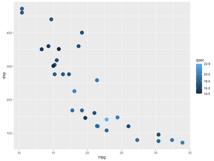
This took me a while to understand, and even though I think this should be built in somewhere, I ended up with the following function:
# Function to show min and max values on fill color bars.
# Inspiration from https://stackoverflow.com/a/60732101/2152245
# original_func should be something like "scales::breaks_pretty(3)"
breaks_min_max <- function(original_func) {
    function(x) {
        original_result <- original_func(x)
        breaks <- c(min(x),
                  original_result,
                  max(x))
breaks_sort <- sort(breaks)
# If values are too close, drop one of them
close <- diff(breaks_sort) < 1
breaks_sort <- breaks_sort[!close]
breaks_sort
    }
}
Note the very rough method of determining when labels will be too close together. This would need to be modified if working with negative numbers or values that are all decimals.
In use:
ggplot(mtcars,
aes(x = mpg,
y = disp,
color = qsec)) +
geom_point(size = 5) +
scale_color_continuous(breaks = breaks_min_max(scales::breaks_pretty(4)))
Update 2021-09-28:
If you have a log scale, this will also work if you use breaks_log(). Example below. This seems to be sensitive to the number of breaks you set; for the example below, 4 doesn’t work (the top and bottom values aren’t labeled), but 6 does.
ggplot(mtcars, aes(x = mpg, y = disp, color = qsec)) +
geom_point(size = 5) +
scale_color_continuous(trans = "log10",
breaks = breaks_min_max(scales::breaks_log(6)))


